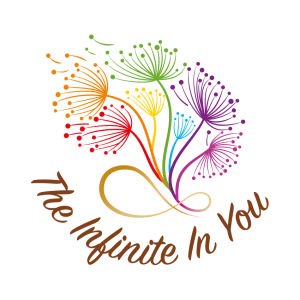
This logo is more than just an image; it’s a visual statement about resilience, energy, and divine connection.
The Dandelion: A Symbol of Unbreakable Spirit.
The choice of the dandelion is particularly touching. It’s often seen as a weed, yet it’s an unstoppable force of nature. This flower beautifully captures the spiritual journey of thriving through adversity. It represents the tenacious, unwavering spirit within you—the one that holds onto hope and faithfulness no matter the challenges. Like the fluffy seeds that scatter on the wind, it also symbolizes renewal and the realization of fulfilled wishes.
Chakra Colors: The Flow of Life.
By coloring the dandelions in the order of the chakras, the logo illustrates the essential energetic flow of the human body, from the grounding Root Chakra all the way up to the spiritual Crown Chakra. This placement signifies a state of balance, alignment, and holistic well-being, suggesting that the energy behind your work or mission is fully balanced and flowing.
The Golden Infinity: Rooted in the Divine.
The foundation of the entire design—the Infinity symbol in a gold-ish color—elevates the logo to a sacred level. The gold hue signifies the highest spiritual vibration: Christ-consciousness or the Divine connection to Source (God). By grounding the chakras in this symbol, the logo sends a powerful message: your human journey and energy (the chakras) are eternally connected to the limitless, unconditional love of the universe. It is a visual affirmation of “The Infinite In You.”
This logo is a testament to the idea that your resilient inner spirit is eternally rooted in the Divine.